
At Tint, we were using Material UI v4 and decided to migrate to MUI v5 recently.
Let’s benefit from this migration to share our (painful) experience.
In this post, we are going to share how we performed a gradual migration and detail all the pitfalls we faced during the process.
Why upgrade?
We naturally decided to upgrade to V5 to get the most out of MUI’s new features and changes:
- 🚀 Better performance, bundle size reduction, unstructured imports can be used when importing multiple components
- 💅 Easier and faster customization thanks to
styled-components, thesxprops and new components, - 💎 New components that have evolved from the lab: Pagination, Rating, Skeleton, Autocomplete, Toggle, advanced tables, MultiSelect, Dropzone buttons, and many more!
- 📄 Better documentation, Typescript tab for each component
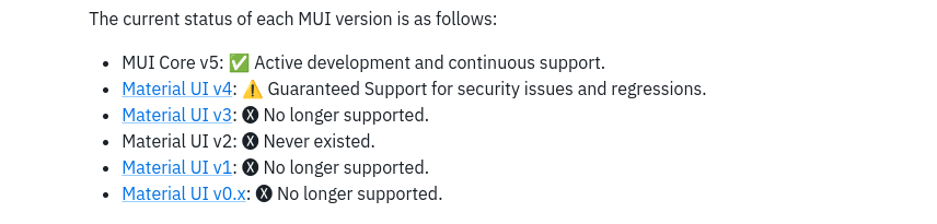
Moreover, Material UI v4 reached its end of life and is no longer supported by the MUI organization.
The key words to summarize: better efficiency, more performance, and freedom! ✊
Finally, the new MUI version is also equipped with refreshed design kits (Figma, Sketch, Adobe XD), for the greatest pleasure of our designers 🤗
Main Takeaways
We decided to avoid a big-bang migration to not put the toil on our growing engineering team. The components were migrated little by little, allowing the team to follow each change.
We’re recommending following the official migration guide from MUI, we will only focus on a few items that took us a lot of time and wanted to highlight.
Update MUI Core version
The easiest step and the beginning of the hostilities!
npm install @mui/material @mui/styles
// or with yarn
yarn add @mui/material @mui/styles
To migrate components imports, MUI provides the following codemod which would take care of changing everything for us.
npx @mui/codemod v5.0.0/preset-safe <path>
For small projects, the migration can be very fast with this simple tool.
However, in our case, we could not use it because our whole application was relying too much on the makeStyles helper (which is a common but legacy styling solution for MUI v4) that we wanted to remove.
The makeStyles hook is no longer part of the v5 API but is still available as a helper to ease the migration.
Importing both v4 and v5 in the same app
Because a migration can be longer depending on the size of your project, it can be vital to move forward gradually.
On our side, we chose to opt for this strategy and import both the v4 and the v5 themes to avoid a big bang migration.
import v4Theme from "@ui/src/v4/theme";
import { ThemeProvider as MuiThemeProvider } from "@material-ui/core/styles";
{
  /* V4 imports */
}
import { ThemeProvider } from "@mui/material/styles";
import theme from "@ui/src/theme";
{
  /* Precious v5 imports */
}

const App = () => {
  return (
    <MuiThemeProvider theme={v4Theme}>
      <ThemeProvider theme={theme}>
        {/* The rest of your application */}
        {/* Both v4 and v5 components will work here */}
      </ThemeProvider>
    </MuiThemeProvider>
  );
};

export default App;
The MUI Theme Provider uses a different React context to dissociate the components from Material UI v4 and MUI v5.
Thus, we were able to start our migration page per page and each component will be able to recognize its own theme 🙏
Styling
Now that we’ve upgraded the core MUI, we can now focus on upgrading our components page per page.
Bye JSS, welcome Emotion
Material-UI v4 used JSS as its CSS library. With the new version, they transitioned to Emotion.
Emotion is a CSS-in-JS library ideal for dynamic styling.
The new MUI version comes with Emotion and styled-components. We choose Emotion, but you can read the comparison between both in this superb article from LogRocket.
@mui/styled-engine: implemented with emotion (by default).@mui/styled-engine-sc: implemented with styled-components
In any cases, MUI provides the sx prop and the styled API as wrappers around Emotion to customize the component styles.
Injecting CSS with StyledEngineProvider
During the migration, if using both v4 and v5 theme providers, we need to use the StyledEngineProvider, in order for MUI to inject Emotion CSS first (over JSS)
import { StyledEngineProvider } from "@mui/material/styles";

export default function GlobalCssPriority() {
  return (
    <StyledEngineProvider injectFirst>
      {/* Your component tree. Now you can override MUI's styles.🤗*/}
    </StyledEngineProvider>
  );
}
Once we are no longer dependent on JSS, the order should be correct and this wrapper could be removed.
Replacing makeStyles
[!WARNING] In v5,
makeStylesare imported from@mui/styles, but this lib depends on JSS as a styling solution. JSS is no longer included in the@mui/materiallib anymore but still is in@mui/styles, which isn’t compatible with React.StrictMode or React 18.
Removing the makeStyles helper is the biggest effort of this migration!
It’s now considered deprecated in the MUI API, and they plan to remove it in the next version.
In the meantime, it is encouraged to adopt the styled API and sx prop.
The MUI team offers us a solution to automate the migration:
$ npx @mui/codemod v5.0.0/jss-to-styled <path>
Again, we recommend avoiding the usage of codemods for the simple reason that it will make the codebase harder to read.
Here is an example of what the codemod produced:
Before
const useStyles = makeStyles(() => ({
    archiveButton: {
        color: red,
    },
}));

export const ButtonExample = () => {
    const classes = useStyles();

    return <Button className={classes.archiveButton}>;
};
After - codemod’s output:
const PREFIX = 'ButtonExample';
const classes = {
    archiveButton: `${PREFIX}-archiveButton`,
};

const Root = styled('button')(() => ({
    [`& .${classes.archiveButton}`]: {
        color: red,
    },
}));

export const ButtonExample = () => {
    return (
        <Root>
            <Button className={classes.archiveButton}>
        </Root>
    );
};
Instead, we prefered to just rewrite the following code with the sx prop:
export const ButtonExample = () => (
  <Button sx=>
);
and it’s DONE, only with this: simple and efficient! 🎉
SX Prop and Conditional Styling
With Material UI v4, we relied a lot on makeStyles to apply conditional styling to our components.
Instead, we’re now just writing ✨ Just JavaScript™ ✨ as shown below.
Before:
const useStyles = makeStyles(() => ({
    boxChangeColor: {
        backgroundColor: ({ clicked }) =>
            clicked ? 'primary.dark' : 'secondary.light'
        ),
    },
}));

export default function ToogleBox() {
    const [clicked, setClicked] = useState(false);

    const handleClick = () => {
        setClicked(click => !click)
    };

    return (
        <>
            <Button onClick={handleClick}>Toogle</Button>
            <Box className={boxChangeColor} />
        </>
    );
}
After :
export default function ToogleBox() {
  const [clicked, setClicked] = useState(false);

  const handleClick = () => {
    setClicked((click) => !click);
  };

  return (
    <>
      <Button onClick={handleClick}>Change</Button>
      <Box
        sx=
      />
    </>
  );
}
The particularity of the sx is to be able to manage a conditional rendering in all simplicity.
Theme Customization with TypeScript types
We can take advantage of this migration to enhance our theme and easily create new colors, variants, and properties inside and outside the color palette.
We now have better control over our theme.
import { createTheme, Button } from '@mui/material';

// 1. Create the theme.
const theme = createTheme({
  palette: {
    neutral: {
      main: '#d79b4a',
    },
  },
});

// 2. Notify TypeScript about the new color in the palette
declare module '@mui/material/styles' {
  interface Palette {
    neutral: Palette['primary'];
  }
  interface PaletteOptions {
    neutral: PaletteOptions['primary'];
  }
}

// 3. Update the Button's color prop options
declare module '@mui/material/Button' {
  interface ButtonPropsColorOverrides {
    neutral: true;
  }
}

// 4. Profit
<Button color="neutral"  />
Examples above are from **MUI’s documentation*.**
__
Using styles shortcuts
MUI also has new custom properties shortcuts.
<Slider sx= />
// This example is equivalent to
<Slider sx= />
We choose to not make extensive use of those shortcuts as we find that it makes the code a bit less readable for new engineers 😕.
But if you like it, here are a few examples:
mt=>marginTopmx=>marginXpb=>paddingBottom- etc
Bonus: The New Stack Component
We also took advantage of the migration to use the new Stack component and this one is a blessing.
In our codebase, we were using the Grid component a lot as an helper to use flexbox, and it made the code hard to read.
On the opposite Stack, as a directional stack, makes the code more readable and accessible 🕵️♀️.
Before :
<Grid container direction="column" justifyContent="center" alignItems="center">
  <Grid item>
    <Box>Hello</Box>
  </Grid>
  <Grid item>
    <Box>From Tint!</Box>
  </Grid>
</Grid>
After :
<Stack justifyContent="center" alignItems="center">
  <Box>Hello</Box>
  <Box>From Tint!</Box>
</Stack>
In addition, there are also some very interesting new components to use: Skeleton, Autocomplete, la pagination and the loadingButton.
Challenges we faced
Codemods that are doing more harm than good
As seen earlier, we were not recommending the codemod to remove the makeStyles hook because it generated too complex code.
Another one that we’re not recommending is the following:
npx @mui/codemod v5.0.0/preset-safe <path>
This one is supposed to replace your MUI imports from @material-ui/ to @mui.
However, sometimes you end up with this kind of import:
// Before
import Grid from "@material-ui/core/Grid";
// After - Codemod output
import Grid from "@mui/material/Grid/Grid";
// Expected
import Grid from "@mui/material/Grid";
The double Grid is not a problem but for our unit tests which are transpiled with Babel 😥.
Jest encountered an unexpected token
Jest failed to parse a file. This happens e.g. when your code or its dependencies use non-standard JavaScript syntax, or when Jest is not configured to support such syntax.
Totally revamped DatePicker
MUI lab DatePicker has been totally changed.
Not only its API, but its whole look-and-feel and UX.
It has been totally rewritten from scratch, the most important change being that the onChange callback is called multiple times while picking a date and time, and the onError callback API changed as well.
Moreover, since April 2022, the date picker has been moved again MUI X.
Please read more details here: https://mui.com/material-ui/guides/pickers-migration/
This component alone caused a lot of trouble and we’re now considering writing our own component for that reason.
Storybook and MUI v5
As seen above, MUI uses Emotion to style its components.
Because of that, the MUI theme conflicts with the storybook theme to take over the MUI one.
To solve this, it was necessary to overwrite Emotion’s import path from the Storybook configuration.
To do so, with used an alias :
const path = require('path');
const toPath = (filePath) => path.join(process.cwd(), filePath);

 module.exports = {
   stories: [
 // Your stories.
             ]
 //Change path Emotion.
      config.resolve = {
            ...config.resolve,
            alias: {
                ...config.resolve.alias,
                '@emotion/core': toPath('../../node_modules/@emotion/react'),
                'emotion-theming': toPath('../../node_modules/@emotion/react'),
            },
        };
But, if you have the** 6.4 version or above **of Storybook you can detach the dependency with the emotionAlias boolean :
module.exports = {
  features: { emotionAlias: false },
};
Final words
On a large application, it’s easier to import both MUI versions with each theme to migrate it gradually.
The sx props are very handy and available on each component and saved us some precious time in the removal of makeStyles.
On a final note, since this blog post was published, a new initiative in our UI team took place: introduce Tint Design System.
To that end, we choose to get away with Material UI.
Material UI served us well at Tint’s inception and was really suited for a small team!
Now that our product is evolving as well as the engineering team, we took another path that might be the topic for a future blog post.
About the author
